Pen and Ink Shading Techniques for Botanical Art
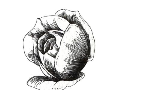
Most of the questions students send me are not really about drawing. They are about shading. Ink is a strict medium in one particular way: it gives you no middle grey to mix. Every tone in a finished botanical drawing is built from marks, which means lines, dots and the white paper left between them. My own work is almost entirely monochrome, one colour of ink on white paper, so shading carries the whole drawing. Once you know the small family of marks and when to reach for each one, shading stops being guesswork and becomes a set of quiet decisions.
In this post I will walk you through the five techniques I use in nearly every piece, from a single leaf study to a full ornamental border. None of them needs special tools. A fineliner or two, smooth paper and a scrap sheet for testing will carry you a long way.
The main pen and ink shading techniques
These five marks cover almost everything you will see in botanical ink work. Learn them separately and practise each one on scrap before you start mixing them.
Hatching
Hatching is a set of parallel strokes laid side by side. The closer together the strokes, the darker the tone reads from a normal viewing distance. The one rule I ask students to hold onto is this: let the direction follow the form. On a long leaf, strokes that run with the midrib describe its length. Strokes that run against it fight the shape. Keep your spacing even, lift the pen cleanly at the end of each stroke, and resist the urge to scrub back and forth.
Cross-hatching
Cross-hatching is a second layer of hatching laid over the first at a different angle. It is how you reach deeper tones without crushing your strokes together. For botanical forms, keep the angle between the layers shallow, somewhere around twenty to thirty degrees. A full right angle reads as woven fabric or wire mesh, which suits architecture and drapery far better than it suits a living leaf. Shallow angles keep the layers feeling like one deepening shadow rather than a net.
Contour hatching
Here the strokes are not straight at all. They curve with the surface, the way lines of latitude curve around a globe. This is my favourite technique for petals and leaves, because a curved stroke tells the eye two things at once: how dark the area is and which way the surface turns. A rose petal shaded with straight hatching looks flat. The same petal shaded with strokes that follow its cup and roll suddenly has volume. If petals are what you love drawing, I teach this layer by layer in Detailed Flower Shading: Pen Techniques.
Stippling
Stippling builds tone from dots alone. It is the slowest technique on this list, and the smoothest. Because there are no stroke directions to manage, stippling gives you gradients with no visible grain, which makes it lovely for the soft turn of a petal or the pale underside of a leaf. Hold the pen upright, touch and lift, and keep your hand relaxed. If your dots start growing little tails, you are moving too fast. Slow down and let the rhythm settle.
Line-weight shading
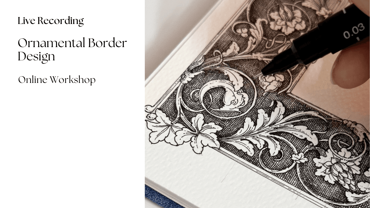
The quietest technique of the five, and the one most often overlooked. Instead of filling an area with tone, you thicken the outline itself on the shadow side of the form while the lit side keeps a fine, light line. On ornamental work (scrolls, borders, rosettes) this alone can carry a surprising amount of depth. It also flatters botanical line drawings you do not want to shade fully: a leaf with weighted outlines already looks dimensional before a single hatch line goes down.
Build your tone in passes
Whatever technique you choose, do not chase your darkest dark in one go. Lay a light first pass over everything that sits in shadow. Step back and look. Then add a second pass only where the shadow deepens, and a third only in the darkest cores. Three or four patient passes give you a controlled range of values. One heavy pass gives you a hole in the drawing that you cannot lighten, because ink does not forgive the way graphite does.
Two small habits will protect you here. First, keep a scrap strip of the same paper beside your drawing and test every new layer on it before touching the artwork. Paper behaves differently from sheet to sheet, and a ten-second test has saved me many finished pieces. Second, if you sketched in pencil first, let the ink dry completely before you erase. Give it ten minutes at least, longer on humid days. Erasing too soon drags fresh ink across the paper and lightens your linework in a way you cannot fully repair.
A note from my desk: slow shading is not a sign that you are struggling. It is the work itself. Some of my favourite passages of ink took a whole evening for a few square centimetres, and I would not trade a minute of it.
Which fineliner sizes to use
You do not need a full set of pens. Three sizes cover nearly everything I do:
- 0.1 for fine detail: delicate first passes, tight hatching in small areas, vein work and finishing touches.
- 0.3 as the workhorse: most of your hatching, cross-hatching and contour work will happen with this pen. If you buy only one, buy this.
- 0.5 for bold accents: the deepest shadow cores, weighted outlines on the shadow side, and anywhere the drawing needs a firm anchor.
A useful discipline is to shade an entire study with only the 0.3, then bring in the 0.1 and 0.5 at the very end. It stops the heavy pen from taking over the drawing.
A small exercise: shade one leaf four ways
Draw the same simple leaf four times in light pencil, each about five centimetres long, all on one sheet. Choose one light source, say the upper left, and keep it identical across all four. Then shade:
- the first leaf with plain hatching, strokes following the midrib,
- the second with cross-hatching, the second layer at a shallow angle,
- the third with contour hatching, strokes curving across the blade,
- the fourth with stippling only.
Work in passes, test on your scrap strip, and give each leaf its darkest tone along the shadow side of the midrib. When you finish, hold the sheet at arm's length. You will see straight away which technique suits your hand and which needs more practice, and you will have a reference sheet worth pinning above your desk. As a final step, add weighted outlines to any of the four and watch how much stronger it becomes.
If this exercise leaves you wanting a bigger challenge, the acanthus leaf is the natural next step. Its lobes and turnovers ask for everything on this page at once, which is exactly why I built Shading Acanthus: Fundamentals around it.
A few questions I often get
Which technique should I learn first?
Plain hatching, without question. It teaches stroke control, spacing and patience, and every other technique on this list builds on it. If you would like a structured path from the very first stroke, my Basics of Pen & Ink course starts exactly there, with drills before drawings.
Why does my cross-hatching look like netting?
Almost always because the two layers cross at or near ninety degrees. Bring the angle down to twenty or thirty degrees and the mesh effect disappears. The layers begin to read as one deepening tone instead of a woven grid.
What paper works best for ink shading?
Smooth and sturdy. A hot pressed paper or a smooth cartridge of 180 gsm or heavier takes a fine nib without feathering and stands up to layered passes. Rough watercolour paper breaks up fine hatching, so save that for your washes.
Do I need all five techniques before starting a real piece?
No. Hatching plus line-weight shading will carry a complete botanical study on their own. Add the others as your drawings ask for them.
Comments
Loading…